In 2022, hardly a year after I made my collection of Capture One styles available for sale, I started working on a new collection of looks for where my photography was taking me. Digital photography was advancing rapidly with respect to dynamic range and resolution, and editing software itself was growing in its capabilities. I had to make sure that my editing process evolved as well.
After two years of work and plenty of mistakes, I’ve curated a new list of styles for my photography. And no, this week’s story isn’t a shameless plug for those styles (namely because they aren’t even available for sale). No, this week I’m going to share with the subscribers of Church & Street my process around building styles that I can rely on.
Understanding The Value
When I refer to styles, I’m talking about the recipes you can apply to your image with one click and have a series of edits applied instantly. They can be known as presets or looks, but for the sake of this post I’ll refer to them as styles.
For me, the value of styles comes down to time, ubiquity, and growth. Building a collection of styles is (and should be) an involved process that requires a lot energy up front. The return on this early investment is that in the long-run, you’ll save time by advancing the starting point of your editing process. Applying a style doesn’t usually mean your work is done because you’ll still want to dial in some settings for the image in front of you. But a reliable style can just fast-track you to the finish line.
Next is ubiquity. When you have a collection of styles that you’ve built for your photography, you develop this visual through-line for your work. Your library of images start to feel more connected and seem to occupy the same shared world. You get to this place where you’re defining your look.
Lastly, the value of building a collection of styles lies in your growth. When you take the time to build these shortcuts—and continue to iterate on them over the years—you sharpen your understanding of the editing process. By treating this as a priority in your journey, you’ll deepen your knowledge of a critical component of photography which is post-production. Taking a great photograph is fantastic but you need to finish the job. You need to get that image over the goal line. Well, a photographer with a rich understanding of post-production can do that faster and more often.
Building Your Looks
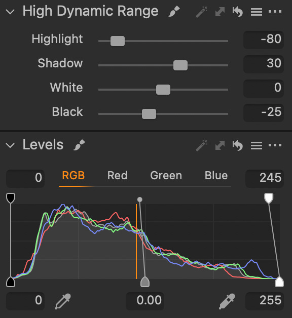
Now that you know why styles are valuable, let’s jump into how I approach building them. Once I have an image that I know I want to edit, I’ll look to use the dynamic range tools (shadows, highlights, whites, blacks, exposure) to correct the overall exposure of the image. This is not a creative edit, it’s just about correcting any under- or overexposure in the original file.
With a neutral looking image in front of me, it’s time to use all the exposure, level, and dynamic range tools to creatively adjust the overall exposure of the image. I’ll first ‘flatten’ the image by raising the shadows and lowering the highlights. This allows me to see more of the colour in the image and get a better understanding of where I want to take the edit. Let me also say, it’s important to create a style that serves the photo, and not the other way around.
With a flat looking image in front of me, I’ll ask myself if I want something that has a lot of dynamic range to it or do I want something with deep contrast that feels punchier? Do I want the colours to feel rich and bold? Or should the colours feel more pastel in nature? Answering these questions are easy when you know what the story of your image is. Once I lock in those answers, I’ll use the same tools I mentioned earlier to dial in the creative exposure of the image.
From here, I’ll look at the where saturation and vibrancy need to be. These are broad tools so I will use them with caution where the goal is to just add or remove small amounts of global colour to reposition the overall edit. Once this is decided, it’s time to get fun with colour.
I’ll jump into the basic colour editing tools (red, orange, yellow, green, etc) and starting playing with the where the hue, saturation, and luminance of these colours should land. Some might require a lot of adjustments while others need no changes. I’ll also move to the colour wheels for the highlights, midtones, and shadows if I want to impact colour with respect to dynamic range (as opposed to colour vs colour). Let’s say that I want to get very granular with a specific colour or skin tone, I’ll use the advanced colour editing tools to fine-tune the image.
Now, I’ve made this sound very simple but the overall process can take hours, weeks, and even months. Don’t put pressure on yourself to find that that special sauce in one day. This is more art than science and you should enjoy the process as much as possible. Once I’ve gotten a colour profile that I feel happy with, it’s time to think about contrast.
I’ll use the contrast slider as a last step to ‘finish’ the look of the image. Most is my contrast is being managed with the curve tool. I’ll work with the luminance curve to adjust contrast without impacting the colours. Then I’ll move to the RBG curve to continue the work. Sometimes the curve I apply here matches the behaviour of the luminance curve but a lot of times it’s the opposite. In short, this opposing approach leads to fascinating blends that add to the overall richness of an image. Try it out for yourself.
There are also individual curves for the red, green, and blue channels. Each style of mine favour a specific colour profile and these individual curve tools help to drive that profile home. I’ll tell you straight up, these tools are very tricky to understand. You’re impacting the individual colour channels with respect to the luminance of the image and that can result in wild changes. But don’t get intimidated. Test them! See how they work. And remember, what might break one image could work well for another.
Once all of this work is done, it’s time to finish the style with sharpness, clarity, dehaze, vignette, and grain. The goal for me is to use these tools to finalize how an image will ‘land’ for the viewer. Should the image feel clean or should it feel textured? I’ll move between these five tools—either adding or removing—to get the style to that happy place where it feels like it completes the story.
And well, that’s everything! In a little over 700 words, I’ve given you my approach to creating a style for my photography. Let me again stress that you should be patient with this process and create styles that serve your photography. It’ll take some time but that’s because the art demands it. Just keep at it. Once you start building a library of styles that feel entirely you, well, that’s just a damn great place to be as an artist.
July Contest: $200 Gift Card for Moment
Starting this month, I’ll be moving to gift cards for our monthly contests. While it was fun to pick a unique prize each month, I feel that having the freedom to pick your own prize is better. Each month, I’ll be giving away a $200 gift card to the Moment Shop where the winner can pick whatever speaks to them.
How am I picking the winner? All you have to do is be a free member of this community and leave a comment on this post. As with every contest, I’ll be randomly picking one person, confirming they meet the requirements and contacting them directly before announcing the winner publicly.
Once again, this contest is void where prohibited by law. Good luck!
My thanks to the team at Moment! Not only for this contest but for being the longest supporter of my work online. They’re a lean team of passionate creators that truly believe in supporting other creatives on their journey. Whether it’s a new camera, lens, workshop, or just some great articles, visit ShopMoment.com today.
Previous Favourites
What’s Next?
Like I mentioned earlier, I spent the better part of two years building a new collection of styles for my photography. For those of you interested, I will be making them available for sale at some point this year. I don’t like pushing my styles on people because I really believe you should ultimately build your own collection, but I don’t discount how valuable a good set of styles can be in the learning process.
My new collection of styles are quite robust and beyond the impact to the image, when you use them in Capture One Pro you’ll be able to see the exact changes I applied with each tool used. My hope is that when people use my styles, they’ll start fine-tuning them for their work as needed and deepen their understanding of the editing process. More on this later.
That’s enough for this week. See ya next time!
GB